Portolan
World connectivity map showing how reachable every territory is
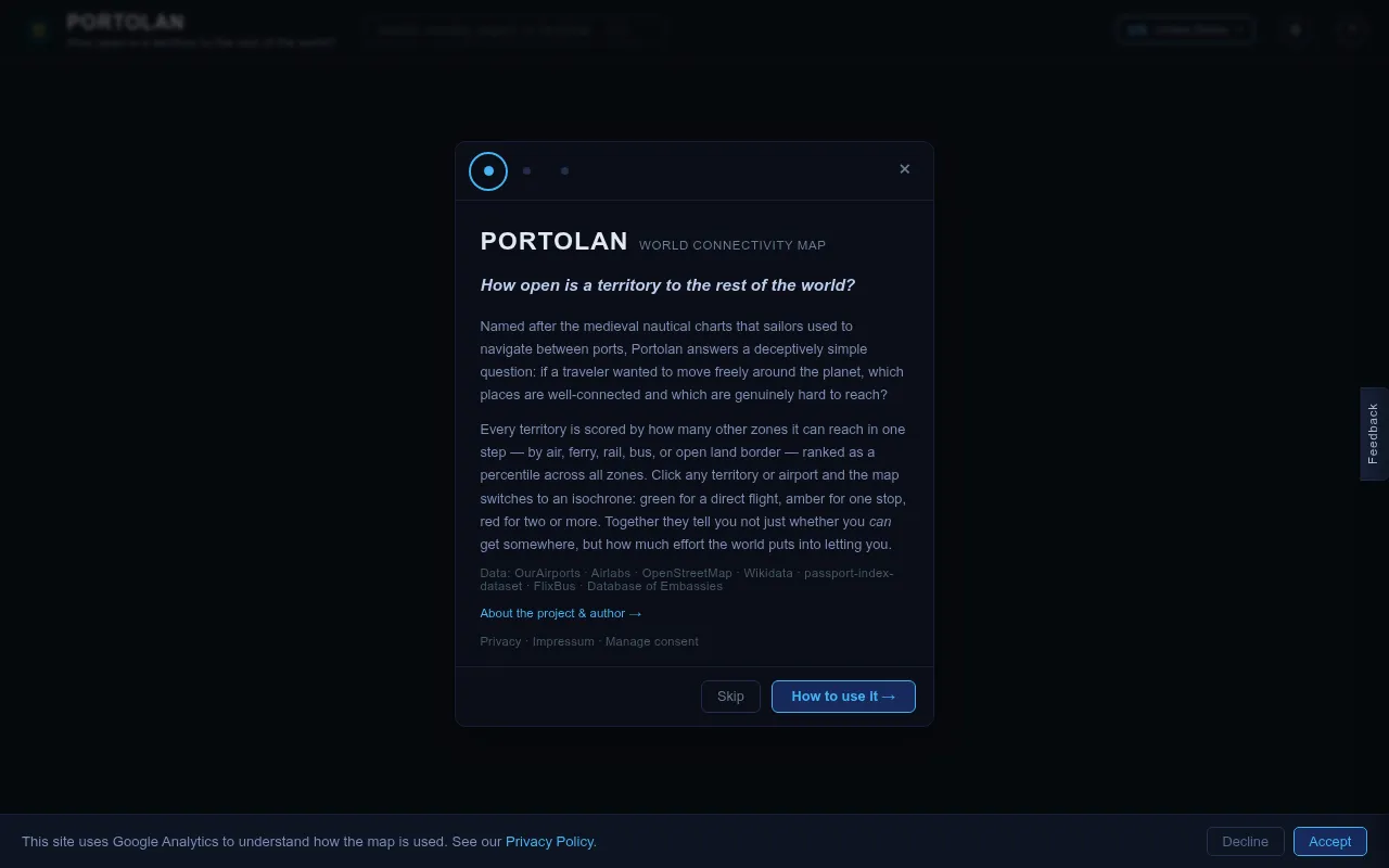
Portolan is an interactive world map that visualizes global connectivity by air, ferry, and rail. Users can select any origin point and see the entire globe color-coded based on how many travel hops it takes to reach each territory. It provides a unique way to understand and explore global travel accessibility.
Users pick an origin location and the map color-codes every territory on the globe by number of travel hops required via air, ferry, or rail.
travelers, geographers, and curious explorers
Background.
- Status
- launched
- Business model
- free
Contact
Similar projects.
Editorial take on the space this project sits in — momentum signals, adjacent moves, our call on whether the wedge is real. Get pinged when we publish a new read or when the landscape shifts.
Have a take on this space?
Tell us what you’d build differently, where you think the incumbents miss, or what we’ve gotten wrong about this project. Comments + reactions are coming soon.